Wednesday, 18 April 2012

Wk 7: Lecture and Tutorial

Had a guest lecturer today, Ruwan Fernando, a PhD student who is also a tutor. He gave me lots to think about, especially considering a concept and thinking that through before even attempting a design. Ruwan also brought up a few things to look at and read, such as Einstein's Tomb by Lebbeus Woods, something called TEDX Talks.
The Rhino and Grasshopper demo I will have to look into and have a play with, because it looks to be a bit of fun.

My tutor, Brett Hudson, gave us ideas of what is expected in the next assignment, in two weeks:
  • All diagrams, very little text
  • Don't worry about colour or materials, just shading and textures
    • Black, white and shades of gray
  • Show volumes and spaces and how they are used
  • Diagrams to show space relationships, use relationships
  • Look at showing how light penetrates and bounces around within the building
  • Shadows and how they affect the spaces, inside and out
  • Put in a fair amount of detail
  • Preferably hand-drawn, but some CAD stuff OK
  • Maybe show other options for the building or parts of it
  • Presentation:
    • Digital, such as PowerPoint
    • Nothing printed is needed
    • Aim for 5 minutes or so
    • No restriction on the slide numbers
    • Each one must show clearly the content and be able to be seen from the other side of the table
As for my own design, Brett suggested I look at keeping the 'crashed house' look of the Folie, as in boxes, crashed up against the cliff as the beginnings of the building; different angles, box bits, how to navigate these 'box bits'.

Lots to think about and lots to draw. In other words, scrap what I have done and start again.

Tuesday, 17 April 2012

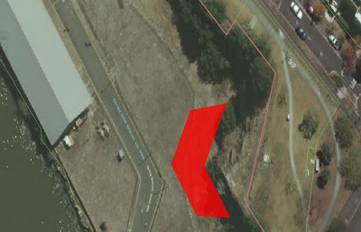
Building location in site

Potential building area on the site.


Closer view of the site.

Further design musings.....

First, ground floor idea, showing 'wavy' walls, (a).


First floor - initial thought (b)


First floor - shortened (c)
Realised that the first plan was too long at 52 mtrs, (a) and (b) above; therefore, shortened the length to 36 mtrs, (c). Will work on this for the moment and see where it goes.


Friday, 13 April 2012

Initial, design musings


Water movement, word play, doodle
Floor plan doodles


Elevation doodles


External wall shape doodles


Random Musings: before Assignment 1

Note: This blog needs to be read at the start of the March blogs.

My first “mind’s eye” image was of a kindly old grandfather watching over the young children while they play and learn in their backyard. The age of the site, the bridge and the old existing buildings represented the grandfather. The children are not just enjoying the site, but learning to appreciate this heritage area, what it represents to Brisbane and to care for it in the future.

A couple of ideas came to mind when first thinking about this project, initially, a children’s learning space, maybe some sort of play equipment that resonates with the site’s history, e.g. in the shape of a ship or bridge or a combination of both. The other idea was more basic and aimed at the public in general, a tunnel of sorts with spaces in the walls and roof, or maybe an arbour, that folks can walk through and read text and look at images from the past.

After a brainstorming session with the other group members, these two ideas took a backseat to many ideas, but the one we settled on was the concept of a worker's cottage, washed from its foundations, carried downriver where it is 'smashed' against the Kangaroo Point Cliffs, near the far south end.

The idea behind this was to remember and experience the flooding of the site, the power of the water, the damage it can do. Along with this experience, the remembrance of how Brisbane was and how the environment still reminds us that we do not control it, but it controls us.

Week 2; Abstraction, Metaphor and Scale(ing)

Note: This blog needs to be read within the March blogs.

When looking for some duirection about "learning spaces", I came across a project that outlines the Seven Principles of Learning Space Design.


Directly from the website:
  • Comfort: a space which creates a physical and mental sense of ease and well-being
  • Aesthetics: pleasure which includes the recognition of symmetry, harmony, simplicity and fitness for purpose
  • Flow: the state of mind felt by the learner when totally involved in the learning experience
  • Equity: consideration of the needs of cultural and physical differences
  • Blending: a mixture of technological and face-to-face pedagogical resources
  • Affordances: the “action possibilities” the learning environment provides the users, including such things as kitchens, natural light, wifi, private spaces, writing surfaces, sofas, and so on.
    • Affordances are the aspects or qualities of a space that allow actions or experiences. Donald Norman refers to ‘perceived affordances’ (1999) to emphasize the fact that it is not just the actual facilities or action possibilities of a space, but the users’ perceptions that matter.
  • Repurposing: the potential for multiple usage of a space
While, most of these principles don't fit too well with our future learning space, I distilled them down to the following:

  • Comfortable
  • Interesting
  • Has good flow through
  • Possesses “action possibilities” - something to do or look at
  • Looks good - has most or all of these qualities; symmetry, harmony, simplicity, is fit for the purpose.
  • Equity - caters for age, ability, mobility
This gives me something to gauge my designs against, from an education point of view.


·         

Initially, my thoughts were for a quite structured Folie, aimed specifically at young children. Designed to create a play space that stimulated their imagination, as well as teaching them something.
The first ideas and doodles:


Sunday, 8 April 2012

Site musings......

Thinking about the site in general and where to site the library/learning space.
Previously, the BCC proposal to redevelop this site, divided the area into three precincts, whether these three precincts will be part of the "redeveloped" redevelopment, I have no idea.
Precinct 1 - hotel and tourism
Located on the western side of the site and included the area under the Story Bridge. Existing sheds, buildings and wharves were to be retained as part of development. A new building was to be constructed under the Story Bridge.
Uses were to include:
  • short term accommodation
  • restaurants
  • shops
  • tourism boat operators
  • visitor centre
  • offices
  • indoor sport/gymnasium
  • recreational facilities
Precinct 2 - restaurant, retail, gallery, entertainment and commercial
Located in the centre of the site and would have offered a combination of new buildings (which are no more than three to four storeys in height) and public open space.
Uses were to include:
  • restaurants
  • retail
  • galleries
  • commercial opportunities
Precinct 3 - active outdoor recreation, entertainment and community facilities
Located on the eastern side of the site and would be primarily used for public open space. The existing heritage listed buildings in this area were to be retained and re-used for community purposes. This precinct was expected to host cultural events and activities.
Uses were to include:
  • park
  • community facilities  <<< This is where the library will fit.
  • boat landing facilities
  • conference centre facilities
  • restaurants/cafes
  • indoor sport and recreation
Reference:

Saturday, 7 April 2012

Areas to consider......


Areas to consider including within the library:
  • Reception/loans desk
  • Childrens books
  • Young adults books
  • Periodicals
  • Reading areas
  • Internet connected computers
  • Viewing areas, for dvd’s etc, could be combined with above
  • Reference books??
  • Staff facilities, lunch room, toilet
  • Public toilets
  • Administration office
  • Meeting rooms for rent
  • Data and comms room
  • Lifts and stairs 
I think I'll go down to the local library on Tuesday, to see if I can glean some more information from the staff.

Friday, 6 April 2012

Project 2: Folie to building.....and so it begins.....

Our tutor, Brett Hudson, gave us some extra constraints for this next project:
  • learning space (which we know about)
  • for children and young adults, 6 - 18 years old
  • material to be presented in black, white and (shades of gray?)
Initial constraints are outlined on the project brief:
  • 500sqm, maximum footprint
  • no higher than the cliff, but a small entrance from the top is ok, as long as it is not obvious
  • can assume a ferry terminal is somewhere, or can be incorporated
  • no structures can be demolished, but can be included in the design
  • don't worry about car parking, but encourage other access routes, bus, ferry, foot, etc
-----------------------------------------------  ||  ----------------------------------------------

In the brief, the lecturer advises us to 'define parameters' to study and to identify the quality of the subject studied.
This is the abstract part that can really 'throw' me. What 'parameter', how do you define it, what relevance to Project 2, how is it relevant, and so on.
One ‘parameter’ I thought might work, is water or the river.
Some aspects to consider:
o   movement - tides, boat wash
o   mood - different times of day, different seasons, different weathers
o   human connectivity - through boats, ferries etc, the bridge, walkways
o   flooding, and its power to destroy or could it be thought of as 'cleaning out', like giant dredge
o   what was the human relationship to the water/river before any bridges, wharves or buildings were built, or even before European settlement
Using the Seven Principles for Learning Places found on previous research, including comfort, aesthetics, flow, equity, blending, affordances and multi-use *, further refinement of the concept using water should be possible.
When asked what is needed to produce, Brett advised, the key concepts behind the original folie, plans, sections, vignettes, scale, form, light, etc, through diagrams, with little text.
I now have some idea of what to do and in which direction, so here’s hoping it’s ok.

*See post from March 28.


Wednesday, 4 April 2012

Library 6 - Vennesla Library, Norway

Vennesla Library by Helen & Hard is also a community center that provides an important cultural space in the downtown area of Vennesla. Located facing an urban plaza with a large glass facade used for natural daylighting, the library encourages movement in the downtown area.
The new building is easily accessible from the main city square and knits together the existing urban fabric. Additionally, a urban loggia with protected outdoor seating areas provides space for people to sit, rest and talk along with sun shading for the building.


Helen & Hard designed the building to be an extension of the city square with a glass facade and what the architects call an “urban loggia”, a partially enclosed space that opens onto a public courtyard.
The building encourages movement from the street through the space and provides open yet protected places for sitting and resting.


The choice of this library was easy, it has an extraordinary use of modern materials and techniques that shows a building does not have to be boring to house a collection of information. It is also situated right in the heart of the town, that shows how a community building can be an essential part of the community by it's location.

The major design elements are 27 prefabricated glue-laminated timber “ribs” that form the interior and exterior geometry of the building. The ribs are structure, infrastructure, and furniture all at once.
More images here.


Each rib is created with a timber beam and column and houses mechanical ducts, lighting, and acoustic material. Faced with CNC cut plywood boards, the curving structures also make up seating and  shelving.
The architects wanted to maximize the use of renewable wood in the project and incorporated 450 cubic meters  of exposed gluelam wood in the signature ribs, inner and outer walls, elevator shaft, floor slabs, and part of the roof.

References:
http://www.smartplanet.com/blog/design-architecture/in-norway-the-prefabricated-glue-laminated-vennesla-library/4518
http://inhabitat.com/vennesla-librarys-ribbed-prefab-design-features-energy-efficient-strategies-in-norway/vennesla-library-helen-and-hard-12/?extend=1

Library 5 - Nam Jun(e) Paik Cultural Centre, South Korea

On the 15th of April 2011 the American architectonic studio NHDM opened for public their new library in the Nam Jun Paik cultural centre in Yong-In, South Korea. The aim of the project was to create a multi-purpose space, and its execution was indeed quite extraordinary. The centre of a spatious room is dominated by a cube, which is a library by itself. It offers bookshelves from the outside, but there is also an inner, multimedial and more private space hidden inside the cube.

I chose this library because of this inner cube. It shows that access to information needs to be transparent, which is shown by this clear cube, within the library.

Inspired by Nam Jun Paik's artistic processes, Nam Jun Paik Library was designed as a multi-functional spatial device, which redefines the relationship between library users and information. In contrast to the conventional library characterised by the one directional transmission of the static, centralised, and predefined content, the Nam Jun Paik Library aims to promote non-linear and random access to information, and its production beyond the prescribed consumption. Through spontaneous expression and juxtaposition of ideas, the consumer of information becomes the producer and the static contents of the library turns dynamic. The collective generation and appreciation of information makes the library experience multi-directional and reciprocal.

The whole object is transparent so it is possible for guests inside to see outside and reverse. The inner space, dubbed „The Library Machine“ contains all historical and contemporary materials regarding Nam Jun Paik and its art. All accessible by public and/or scientists for further research. The materials do not contain only books, but are rather a mass of information stored on paper, video clips and even a rare collection of Fluxus recordings. More images here.

References:
http://www.lusaka.diplo.de/Vertretung/lusaka/en/01/architektur__namjunepaik.html
http://www.architecturelover.com/2012/03/nam-june-paik-cultural-centre-library/
http://www.nhdm.net/nam-june-paik-library2
http://www.tripadvisor.com/Attraction_Review-g1643550-d2293588-Reviews-Nam_June_Paik_ArtCenter-Yongin_Gyeonggi_do.html